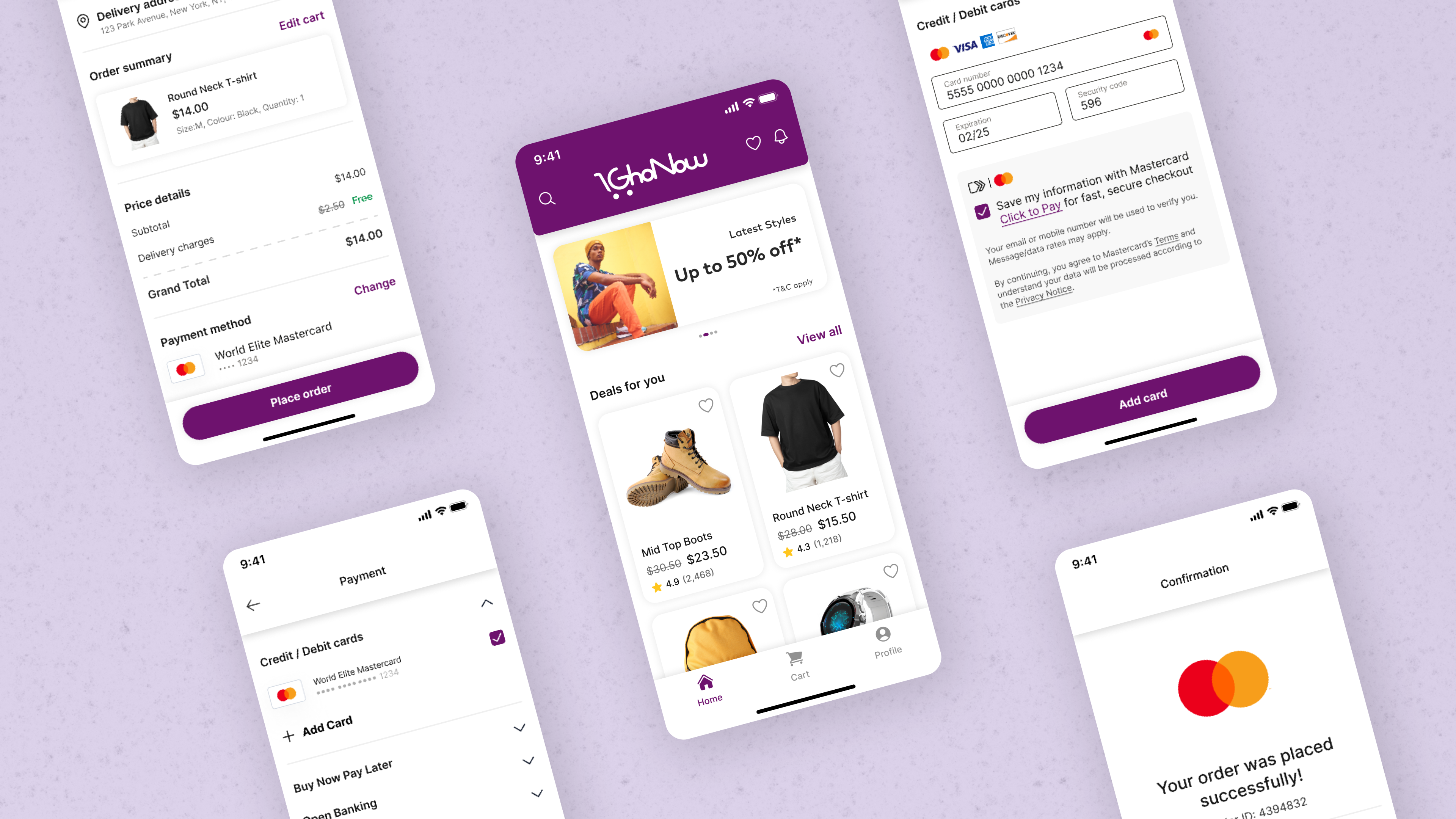
GhoNow
Showcasing product features in a consistent and relatable manner.

Showcasing product features in a consistent and relatable manner.

Mastercard offers several payment solutions and services to banks and merchants. These solutions and services have no front-end UI and are hidden from the end user. Some of such products are Click to Pay, Tap & Go, Buy Now, Pay Later, and Open Banking.
Product teams need auxiliary apps that showcase the end-to-end functionality of these solutions and services. GhoNow is an e-commerce mobile application that is built to support any payment solution and looks very similar to other e-commerce apps.
I led the design for the white-labeled e-commerce mobile app along with one other designer and my design manager.
We reached out to several product teams to document their needs and expectations of one such e-commerce app to highlight the solutions they offer.
The other designer and my manager assisted me with providing already existing apps that we had used in the past and creating components that could be easily modified if needed.
Designing an e-commerce app that feels immersive and relatable to users was the easy part of this project. However, a design that is flexible enough that encompass all the existing Mastercard solutions and future ones, was a challenge.
Before kicking off the design process, we decided to set some end goals that would govern the success of this project:

Based on the survey of product teams, we concluded that all the payment flows looked similar until the checkout screen. After that, the flows started to branch out according to the product being showcased, and the branches merged at the very end of the flow, on the order confirmation screen.
This made the picture clear for us and enabled us to keep the initial screens and the final one similar, with only minor differences based on the payment solution being presented.
For the parts of flows that were dissimilar, they fell under one of the following categories:
To start off, I conducted a competitive analysis to identify similar patterns in the e-commerce apps used globally, since these payment solutions are used and showcased everywhere. While managing realism, I focused on keeping the initial process simple and quick for the user and how to get the user to the solution screen as fast as possible.
Then I examined where the flow looked different and how, and also at which point they merged back again.

Since the first part of the flow was more streamlined, I started wireframing with that. Again, keeping in mind the minimal effort to reach the payment screen and maintaining familiarity aspects of the app, I designed a few mockups and reviewed them with the other members of the design team. After a few rounds of feedback and updates, the initial part of the flow and payment confirmation screens were finalized.
Then came the tricky part: customizing available payment solutions according to the new design and making them coherent with the rest of the flow. This involved creating OTP screens, overlays, card information input screens, redirection screens, etc.
After completing the predecided flows, we tested them with 10 users to see which parts we got right and which could use improvements. Because of testing, we learned that we had cut down to too few screens, and adding additional screens made the flow more comprehensible and natural. So, we added screens like selecting/adding address, order review, and login screen.
Using the wireframes and test results, I prototyped five flows with different payment solutions. Also, I used a distinct yet brand-approved color that made the difference between other merchant and banking apps apparent. This increased user immersion during testing and involved ordering a different product from end to end.
As soon as the white-labeled app was designed, our team received two projects where this app was leveraged. Compared to previous projects, where a white-labeled app was used to showcase features, this time the GhoNow app consisted of almost all the aspects of the product that were being demonstrated. With a few minor tweaks, we were able to deliver projects much faster and cut down the costs and efforts required to customize the white-labeled app as per each product.
In another project, where payment via cryptocurrency was being demonstrated, the designers quickly added crypto as a payment method and used the redirection flow to showcase the feature.
As more products and features are introduced every month, the white-labeled app will be outmoded in no time.
Our team organizes regular meetings with product teams whenever a new product or feature is introduced or updated. This way, we can keep GhoNow and other white-labeled apps relevant and deliver projects faster.