Redesigning ICICI Prudential’s Campaign Management Portal
I was the sole designer for this system that manages all the communication campaigns. The new design reduced task times by 95%
I was the sole designer for this system that manages all the communication campaigns. The new design reduced task times by 95%

ICICI Prudential’s campaign management system allows users to create campaigns, and send emails, SMS, Whatsapp, mobile notifications and physical letters to customers and employees. The users then track the status of those campaigns through reports which display how many were successfully sent, how many failed, and the reason behind it. The user also has an option to upload data for these campaigns from the front end itself. Admins and super admins are responsible for user management, where they can add, remove and edit users on the system.
I interviewed 10 users to understand their wants, needs and pain points. All the users who were working on the old system would migrate to the new one once it goes live. Since most of the users are experienced, a lot of training would not be required for the new system and the new system should be similar to the older one. After conducting interviews with 10 users I was able to narrow them down to two groups:
After the research process I found out that the old system had three major business problems:
After all the interviews, discussions, walkthrough of the old system and requirements gathering process, I was also able to identify users’ main pain points:
Now, here come the design challenges:
Through an interactive design process, I was quickly moving between sketches, wireframes and prototypes, testing wireframes and prototypes with users, and getting feedback from my manager and users. From each iteration, I learned something valuable. Some helped me make small design improvements, others helped me make major usability changes.
After going over all the requirements, I designed a site map and discussed it with the users and the development team. After the discussion sessions, everyone was on the same page for the navigation part of the system.
I created some sketches using the results from the research and Business Requirements Specification (BRS) document. After getting some feedback from my manager and other stakeholders, I made some adjustments to the initial design and use these sketches to design other essential documents.
After getting feedback on the sketches I was able to design wireframes with essential elements grouped together. The design was approached with simplicity and usability in mind. The old systems inspired the pages’ design so the users don’t have to relearn everything and should be able to adopt the new system as soon as it goes live.
I started designing high-fidelity prototypes after a usability testing session with 8+ users on the wireframes. We determined the main screens of the portal and used brand colours in the design. I used Figma and Photoshop for most of the designs and prototypes.
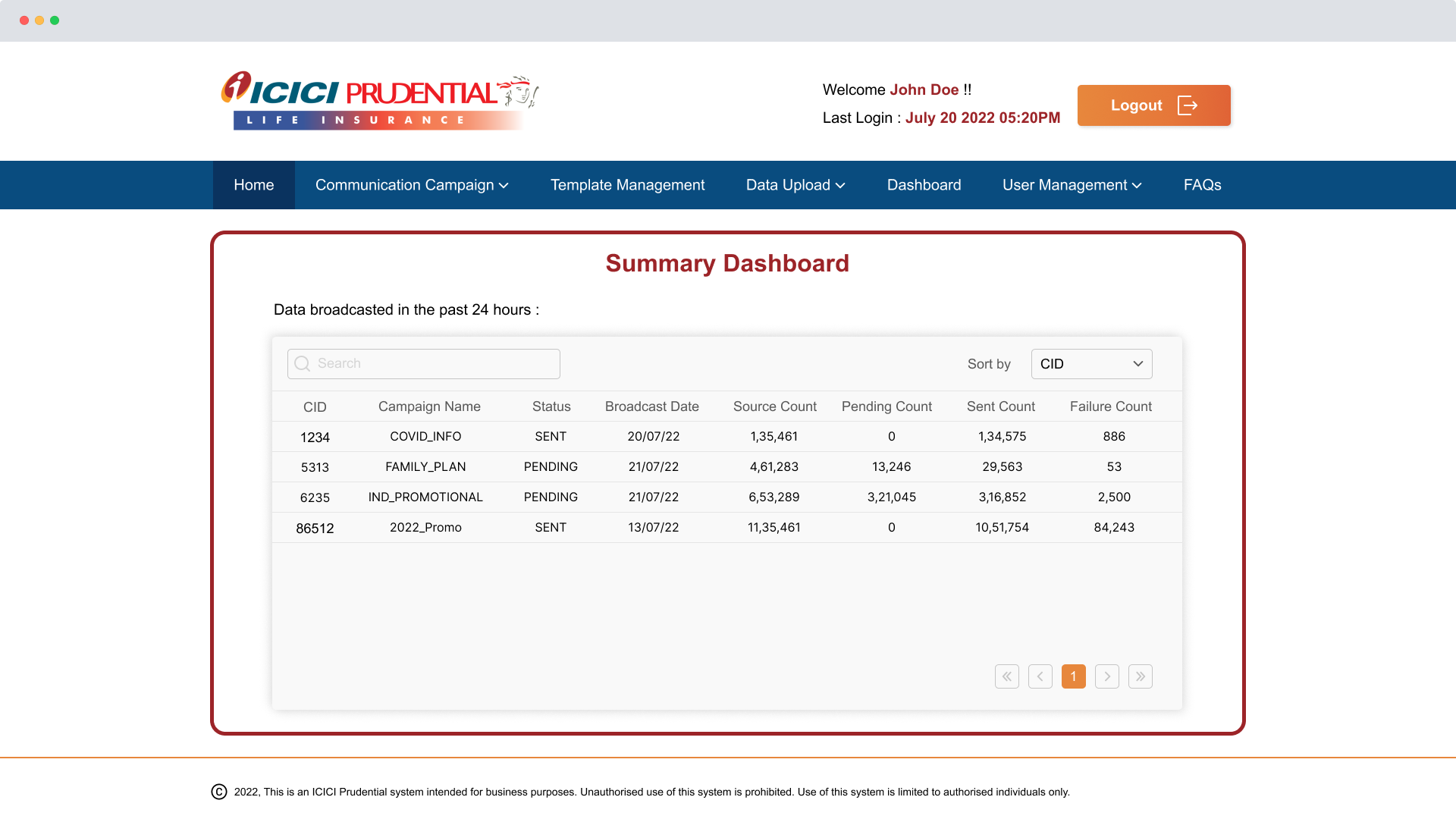
The reason to add a summary dashboard on the home page was that the user won’t have to dig deeper into the portal to determine key information. This will improve their efficiency since all the vital information is available at a glance. They can see the past 24-hour status of campaigns they are managing just by logging in.

The campaign creation form was divided into three parts to make it more intuitive. On this page, users can enter campaign information, then upload attachments and templates and finally verify all the information before submitting it for approval.
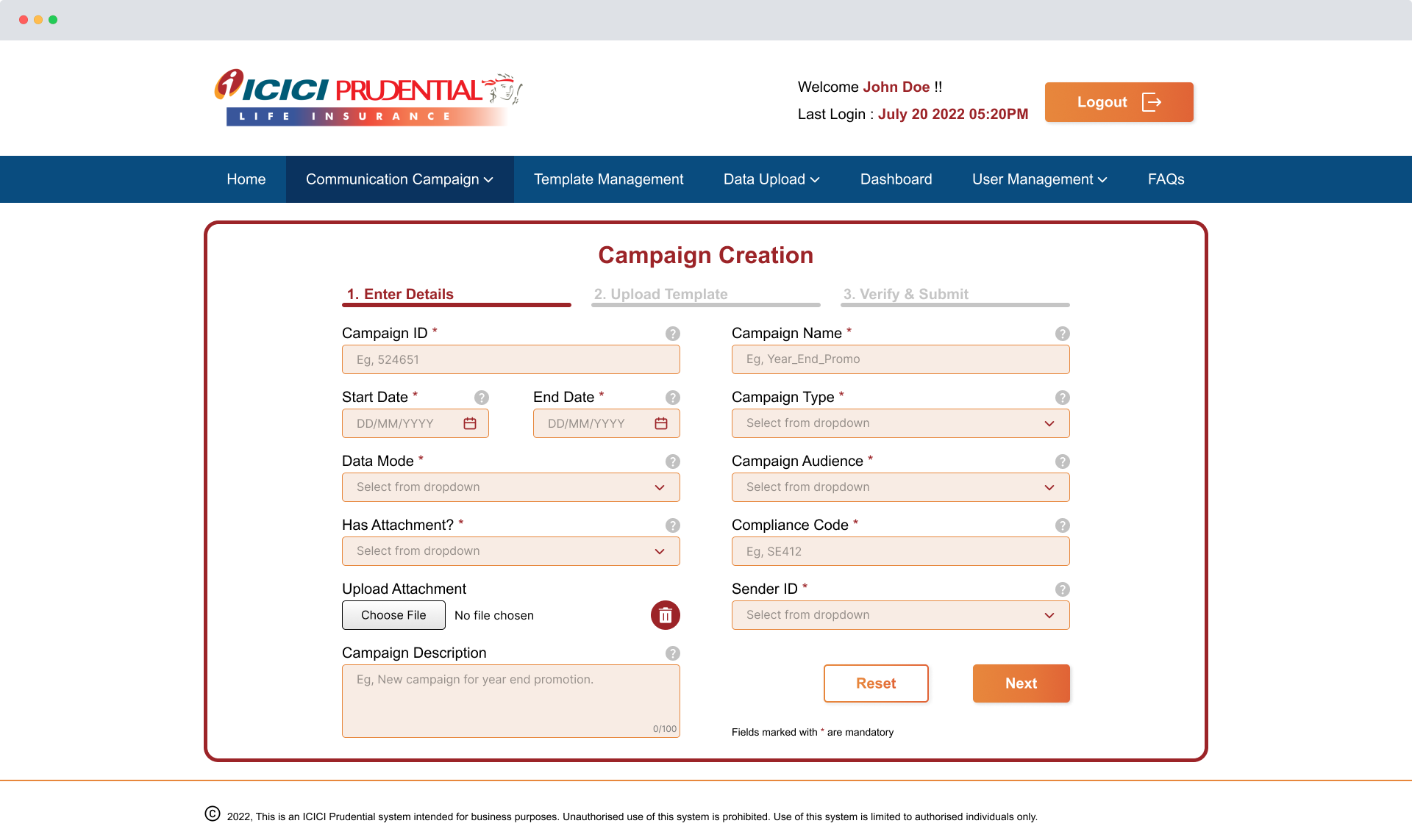
The amount of elements on each screen is kept minimal. This is done to enhance the simplicity and effectiveness of the system. Too many options and buttons often lead to confusion among the users.
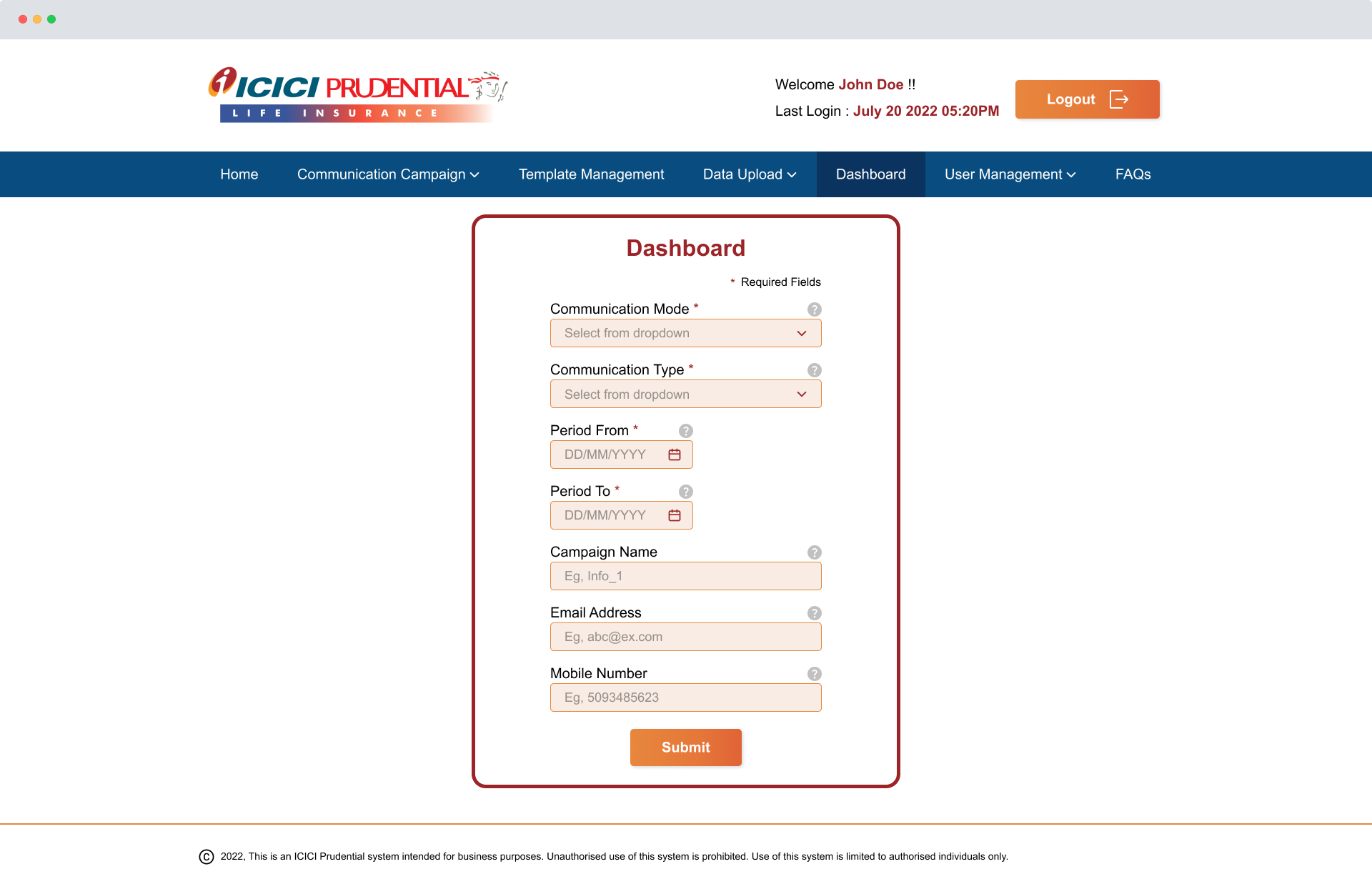
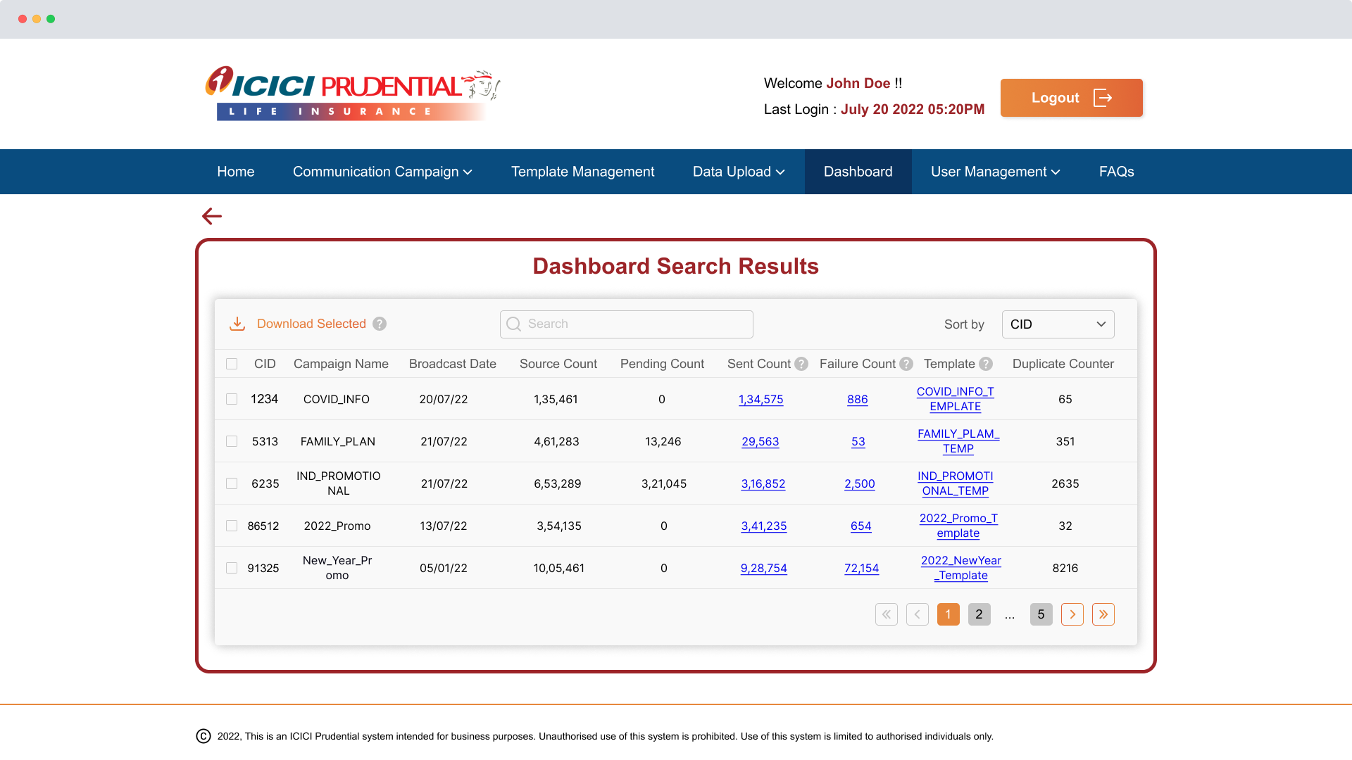
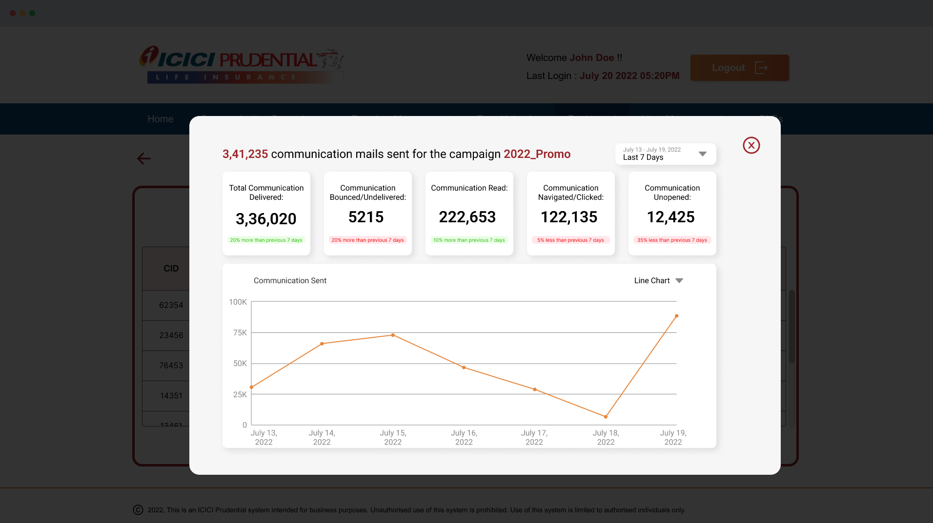
Based on the feedback, most users didn’t need an in-depth analysis of the campaign’s data. So to make it simple for those users, I added an extra step to get to the detailed analysis. Since some campaign managers need several metrics to measure the campaign’s performance, an overlay opens up when they click the campaign name from the table. Here, the users can compare each campaign’s performance from 7 days to up to 2 years.
Always keep all the stakeholders on the same page. Collaborating with users at the early stages of design made the entire process smooth. Since the users were experienced, they were able to clearly communicate the user flows and their issues with the existing system. This helped me with drawing sketches and designing wireframes as I already knew the entire process from start to finish.
The design system is effective! I wasn’t able to anticipate the total amount of screens that would be required for the whole system. As the number of screens grew, there were some inconsistencies among them. Creating components, colour styles, and text styles helped in tackling those inconsistencies. We can also use this design system to further grow the portal if required.
The changes I made were received positively from users. I also did usability tests, with 5 users, to gauge the effectiveness of the new design.
As the sole designer, the most challenging task was to build the design system. It was intimidating at first when compared to how detailed other design systems like Google Material Design are but in the end, it all worked out well.